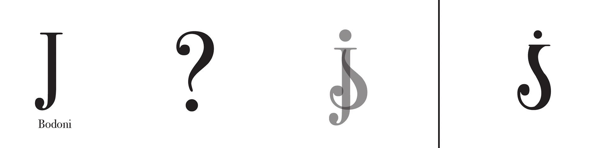
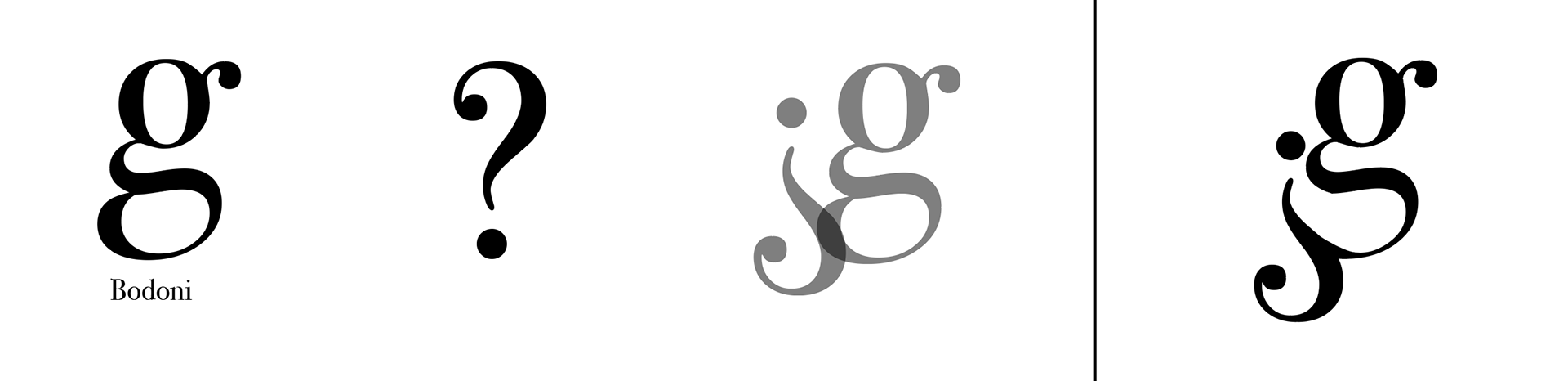
I worked on the Logotype Project in my Typography 2 class. First, I combined two letters/symbols to create a new character in Adobe Illustrator. I created 24 characters in total with 24 different fonts.
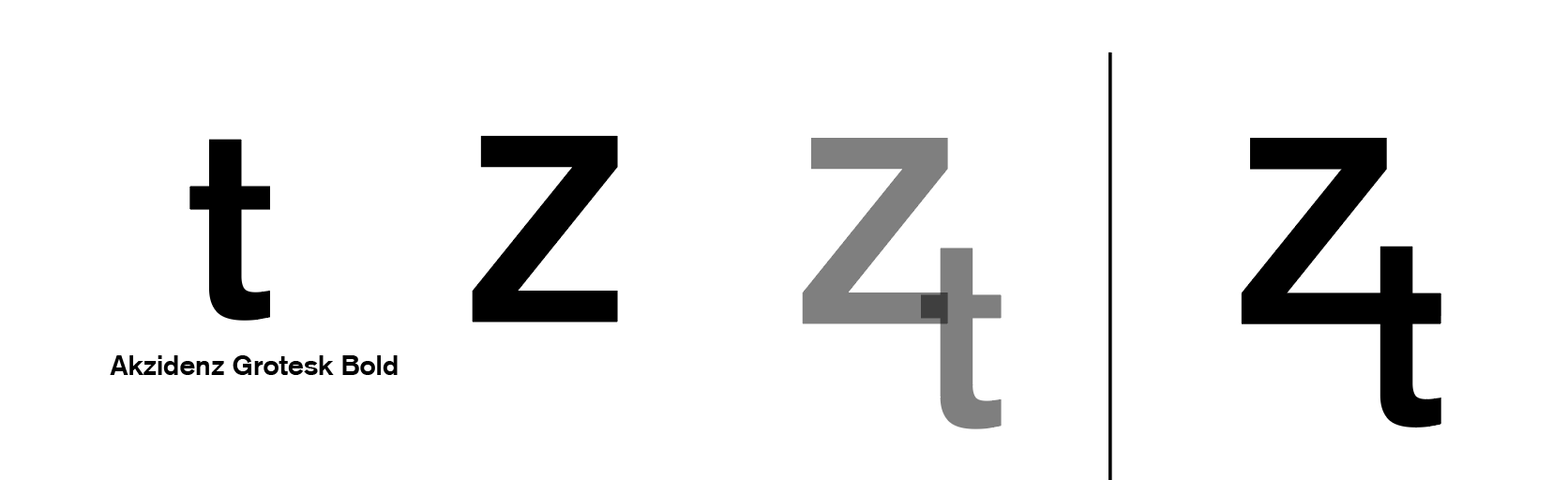
Examples of iterations:
Precious Version
Final Version
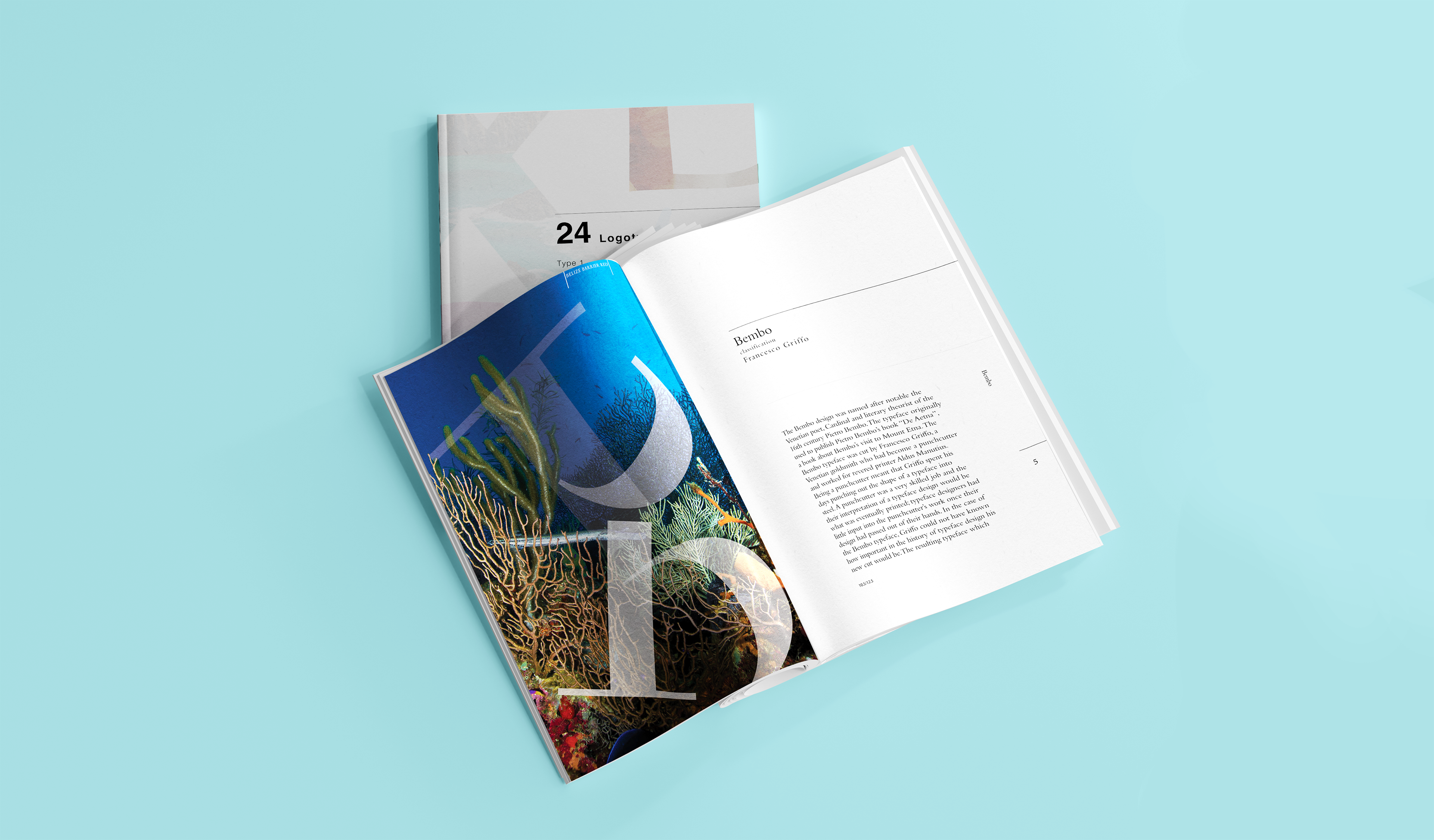
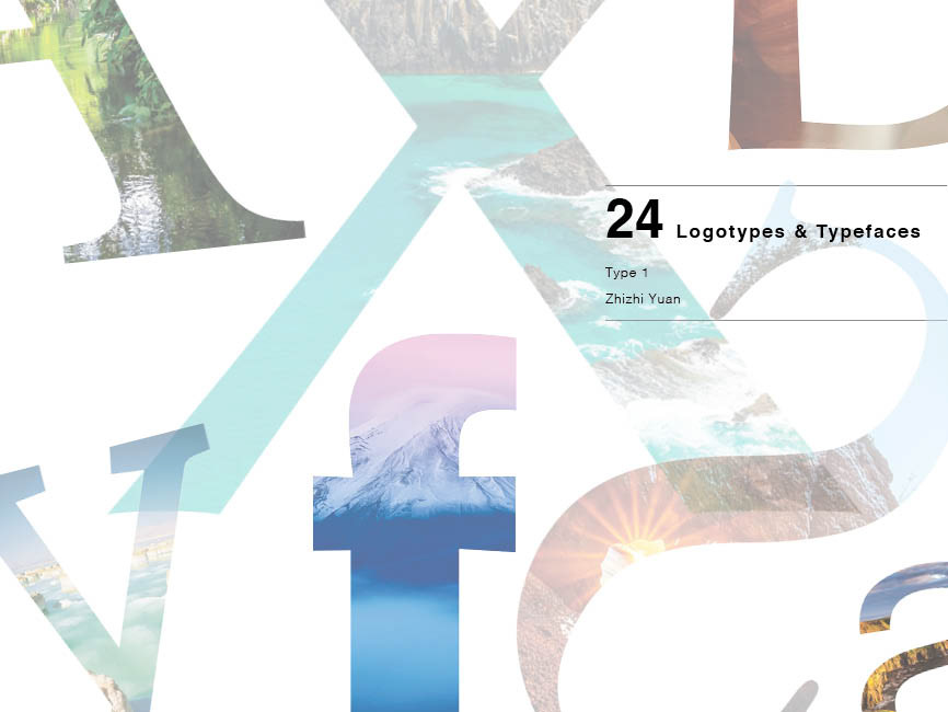
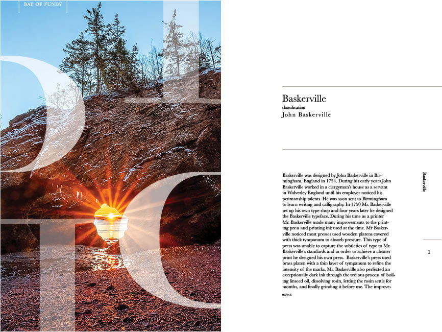
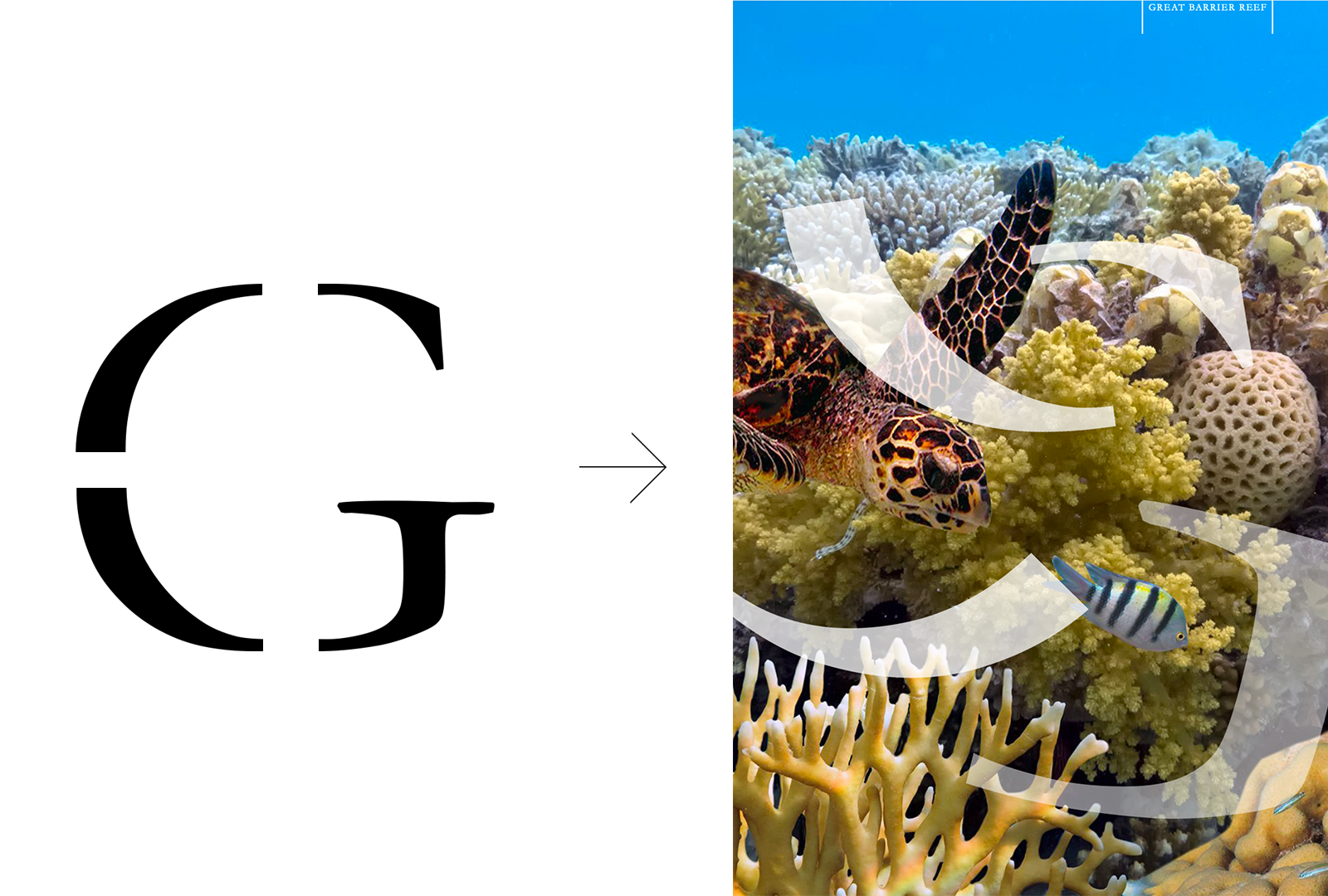
I then created graphics for the book using Photoshop. I chose natural landmarks where the first letter of their names matched the first letter of the font. Then, I put fragments of the same letter on top of the photos.
For example, "Great Barrier Reef" was matched with Garamond. A fragmented "G" was distributed throughout the page.
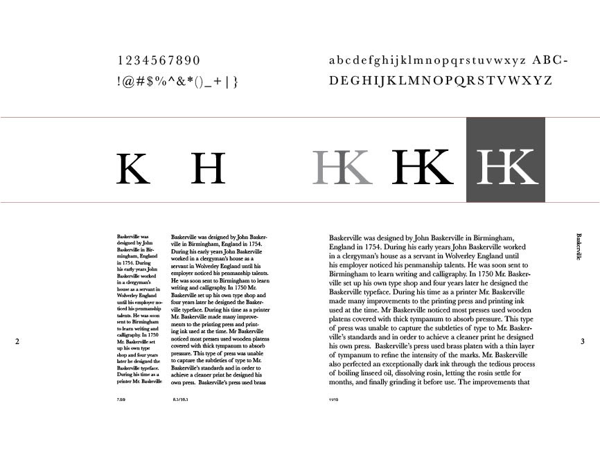
Lastly, I assembled the book in Indesign. I formated the logotype and the graphics into the structure and text my professor provided. I created the mockup using Photoshop with stock image from freepik.com.